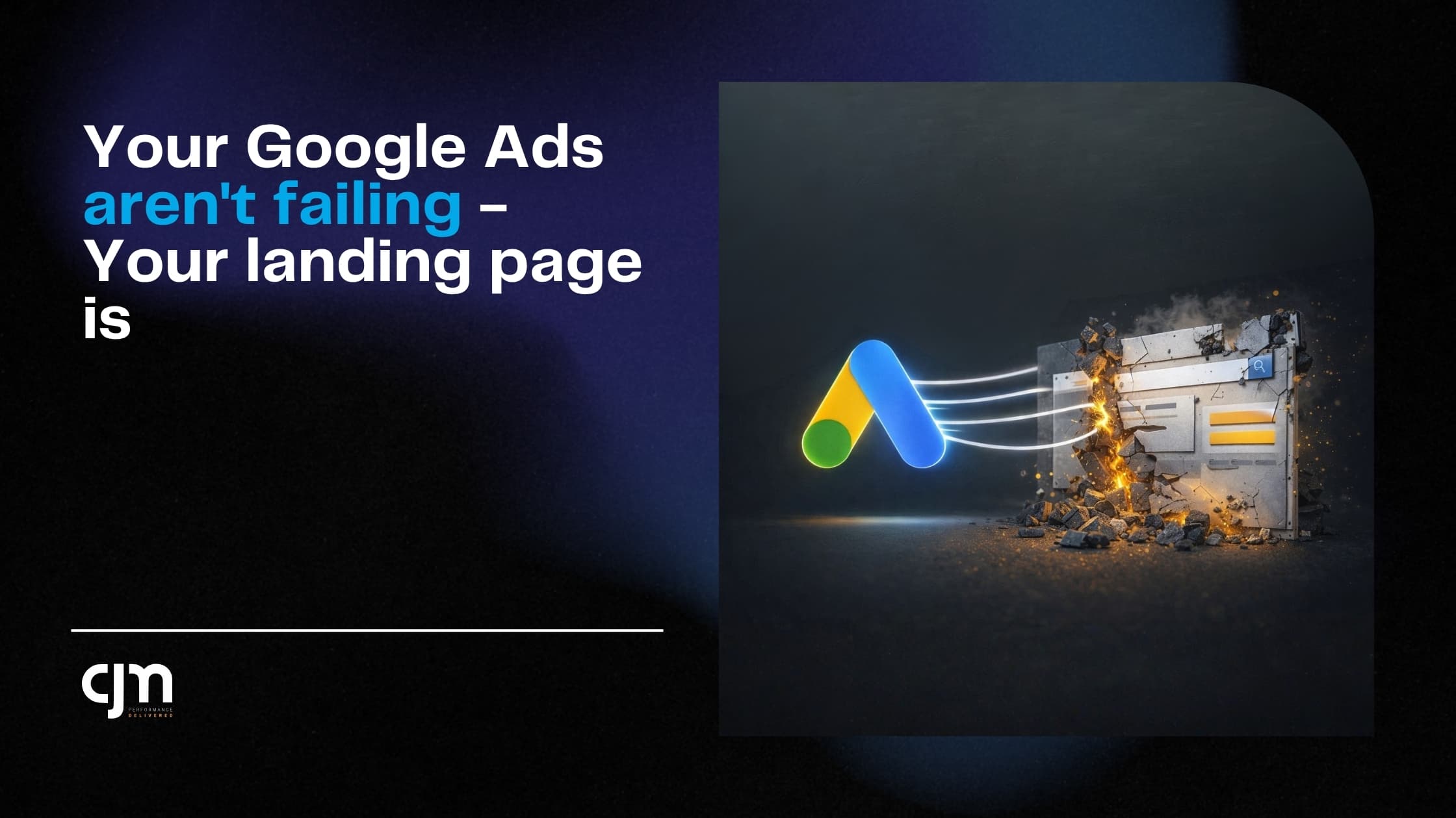
Your Google Ads Aren't Failing — Your Landing Page Is
Aditya
Author
Article Content
Here's a pattern I see almost every week. Someone comes to us and says — "Google Ads isn't working for us." So I ask to see the account. CTR is 4-5%. Quality scores are decent. CPC is reasonable. The ads are doing fine.
Then I click through to the landing page and... there it is. The real problem.
A homepage with 47 navigation links. Or a page that takes 8 seconds to load on mobile. Or a form that asks for your company name, designation, annual revenue, employee count, and blood type.
I'm exaggerating on the last one. But only barely.
The Click Is Not the Conversion
Somewhere along the way, we all got obsessed with the wrong metrics. We celebrate a 5% CTR like we won a trophy. But clicks don't pay your bills. Leads do. Revenue does.
Google Ads is a delivery mechanism. Its job is to put the right person in front of your offer. That's it. What happens next is entirely on your landing page. And most landing pages are doing a terrible job.
The 5 Mistakes I See Most Often
1. Sending traffic to the homepage
Your homepage is designed for someone who's browsing. It has your about section, your services, your blog, your team photos, your client logos. That's great for brand building. Terrible for conversion.
When someone clicks a Google Ad for "best CA firm in Mumbai" they want to see pricing, services relevant to them, and a way to get in touch. Not your company history.
2. Slow load times
I can't stress this enough. If your page takes more than 3 seconds to load on mobile, you're losing more than half your traffic. Not 10%. Not 20%. More than half. Google's own research backs this up.
And no, your page isn't fast because it loads fine on your office Wi-Fi. Test it on a phone on 4G. That's how your customers experience it.
3. No clear CTA above the fold
If I land on your page and I have to scroll to figure out what I'm supposed to do — you've already lost. The action you want me to take should be visible within the first 2 seconds. A button, a form, a phone number. Something.
4. Too many form fields
Every field you add to your form is a reason for someone to leave. I've seen lead forms with 8-10 fields. The conversion rate was under 1%. We stripped it down to Name, Phone, and "What do you need help with?" — conversion rate jumped to 6% overnight.
5. No trust signals
People don't trust random pages on the internet. If your landing page doesn't have client logos, testimonials, Google reviews, or any kind of social proof — why would a stranger hand over their phone number?
What a Good Landing Page Looks Like
It's not complicated. After doing this for dozens of clients, the formula is actually pretty simple:
A headline that matches the ad copy (if the ad says "Free Consultation", the page better say "Free Consultation")
One offer. Not three. One.
A short form — 3-4 fields max
Social proof — reviews, logos, numbers
Mobile-first design (70%+ of your clicks are coming from phones)
Page load under 3 seconds
That's it. No fancy animations. No video backgrounds. No parallax scrolling. Just a clear offer and an easy way to say yes.
The Fix That Costs Nothing
Before you increase your Google Ads budget, try this: take your current landing page, run it through Google PageSpeed Insights, and fix whatever it tells you. Then cut your form down to 3 fields. Then add 2-3 client testimonials.
Do that before you touch your ad account. I'd bet money your cost per lead drops by 30-40% without changing a single keyword or ad copy.
Your ads aren't broken. Your landing page is. Fix that first.